Google is the most popular search engine in the world with the broadest language support. It was created by Sergey Brin and Larry Page – Stamford University students. Another designer – Ruth Kedar – made a great contribution to the evolution of the Google logo, as it came up with a dozen of ideas, which have become encrypted in the logo.
Meaning and history
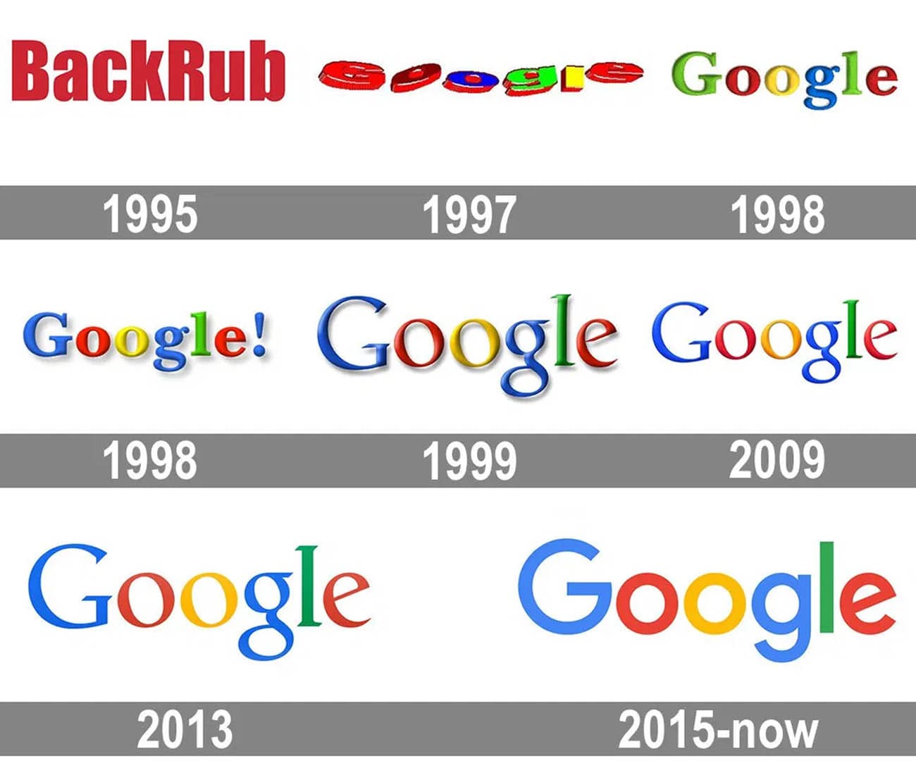
The most used online search engine across the globe, Google, was created in 1995 as BackRub, and luckily changed its name to the one the whole world knows now in 1997. The name “Google” is a derivative from “Googol”, which is a large number. Except for the first two years, while the company had a different name, its visual identity has always been pretty constant. Its brightness and simplicity made the logo truly iconic and instantly recognizable.
1995 — 1997
The BackRub logo, introduced in 1995, comprised a simple red wordmark with two capital letters. The inscription was executed in a bold sans-serif typeface, which is very similar to PF Fusion Sans Pro Black and Impart Family fonts. It was a simple and solid logotype, which stayed with the company for two years, until it got the new name.
1997 — 1998
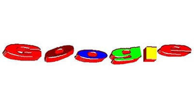
In 1997 the first logo for Google was designed, it was used only for the beta version, but became a base for all the next visual identity designs. The three-dimensional jumping leathers were drawn each in a different color, looking slightly amateurish, it was a funny design, which grew into something truly iconic.
1998 — 1999
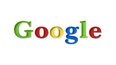
The first official logo was designed in 1998 and featured a title case inscription where each letter was drawn in one of the following colors — green, red, yellow, or blue. The inscription was executed in a transitional serif typeface, Baskerville Bold.
Later in the same year, the blue exclamation sign was added to the wordmark and stayed there for a year. The inscription was made three-dimensional and gained a light gray shadow.
1999 — 2013
The redesign of 1999 brought a 2D shape to the visual identity, along with the new typeface — the Catull BQ serif font, which featured elegant solid lines and sharp serifs. The color palette remained untouched. Another individual detail of the wordmark was a slight inclination of both letters “O” to the left.
Later in the same year, a three-dimensional version was added to the Google visual identity portfolio.
2010 — 2013
In 2010 the shadow was removed from the logotype and the colors became brighter and more intense.
2013 — 2015
The redesign of 2013 brings back the flat logotype, making the logo minimalist and strong. The color shades are refined again, and the serifs if the letters are now more distinct than the ones from the previous versions.
2015 — Today
In 2015 the Google logo was redesigned again. The only thing left untouched is the signature color scheme. The style and shape of the letters are now completely different.
The new inscription is executed in a bold sans-serif typeface, which is pretty close to Muguet, but it was created exclusively for Google and is called Product Sans. Both letters “O” in the title are circle, so no signature inclination here anymore.
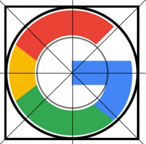
In the same year the new icon was created — the bold letter “G”, executed in the same style, but drawn using all four colors — red, yellow, green, and blue.
New Logo
The current Google logo is based on the sans-serif typerface, and it was unveiled on September 1, 2015. It was chosen because sans-serif tends to be more legible than most other typerfaces when small sizes are used. This version was develop to satisfy users of small-screen mobile devices.
It uses the same color palette as the one introduced in 1998, although the hues are brighter and more consistent. Its colors are arranged according to a so called tetradic color palette, and it adds an optimistic and vigorous feel to the logo design. It is one of the factors that have contributed to Google’s unprecedented success. Apart from the standout factor, bright colors cater to the global cultural diversity and have a kind of unifying power.
On some occasions (usually sad), Google displays a colorless version of the logo. Thus, the light-gray logo was on Google Poland for several days following the plane crash, in which Lech Kaczynski, the President of Poland, was killed. Shortly after that, it appeared on Google hong Kong and Google China in memory of victims of the Quanghai earthquake in China.
Symbol
The earliest favicon was just an uppercase letter “G” in blue placed inside a square frame. In 2008, it was replaced by a lowercase “g” in light blue, while a couple years later a new, multicolored palette was introduced. The 2012 favicon looked like the 2008 one with the colors inverted.
In 2015, simultaneously with the new logo, an updated favicon was introduced. Some designers note than the current Google favicon is slightly reminiscent of the 1993 logotype of the clothes brand Gymboree. The first letter in the Gymboree wordmark had almost the same shape as the one used in the Google favicon, while the color palette was totally different.
“White” emblems
As mentioned above, during times of great tragedy the company often uses a colorless logotype. There have been several “white” logos so far. In each case, the “white” logotype has exactly the same shape as the regular one, the only difference is the color scheme. While the earliest colorless logos featured a 3D effect, the current one, as well as the 2013 version, is flat.
Font
The latest version of the Google logo uses the sans-serif font, which is different from Times New Roman and ornamental fonts, which the wordmark had appeared in before. This font has a bold and streamlined shape, which makes it pixel-friendly, so it suits all resolutions; therefore, the wordmark is legible on all sorts of devices.
Google Plus logo
The Google Plus logo is based on the uppercase “G” given in the same typeface as in many other Google’s products (for instance, Google Search). The letter itself is white. Next to it, there is the plus sign, also white. They are placed inside a circle with red filler. The logotype looks dimensional due to the shade effect. Interestingly enough, the combination of colors and the “+” sign make the Google Plus logo somewhat similar to the Red Cross emblem, although the colors are inverted there.
Google Play logo

Google Drive logo
Both the colors and shape of the Google Drive logo have a symbolic meaning of their own. The Google Drive comprises three options: DOCS (a blue logo), SHEETS (green), and SLIDES (yellow). So, each color of the Google Drive logo represents one of the services it encompasses. The triangle emphasizes the concept “three”, while the fact that it is a closed figure symbolizes that your data is protected.
Google Maps logo
The wordmark includes the word “Google” looking exactly like the regular Google logo and the word “Maps” in grey. Unlike the 2013 version, the first letter of the name of the service is capitalized. The favicon features a stylized map with two roads (a yellow and a white one) and three fields (blue, green, and grey). Also, there is a red balloon sign with a round dot in a darker shade of red.
Google Analytics logo
Icon


What is the current logo of Google? The current Google logo, introduced in 2015, featured a bold and stable title case inscription in a modern geometric sans-serif typeface, with each letter drawn in one of the four corporate Google colors: blue, red, yellow, or green.
Why is the Google logo grey today? The Google logo changed its iconic four-shade color palette to plain grey in September 2022, as a mark of respect for Britain’s late Queen Elizabeth II, after her death. The company will return to its red-blue-yellow-green palette.
Why does Google use 4 colors? The iconic Google color palette, composed of four shades, stands for the four main elements: air, earth, fire, and water. It also represents the variety of Google services and shows their endless possibilities. The red, blue, yellow, and green colors are used for all service marks of the company, showing unity and connection.
What does the Google logo represent? The instantly recognizable all over the globe Google badge is not just the wordmark with the name of the company, but something more interesting. This badge represents a distortion of the word Googol, which means ten to the hundredth degree, and describes the infinite performance of the new search engine.


